
Inneo
BRAND STRATEGY, NAMING, BRAND DEVELOPMENT, WEB DESIGN AND DEVELOPMENT, BRAND LAUNCH
A total brand transformation to compete in a rapidly shifting healthcare environment
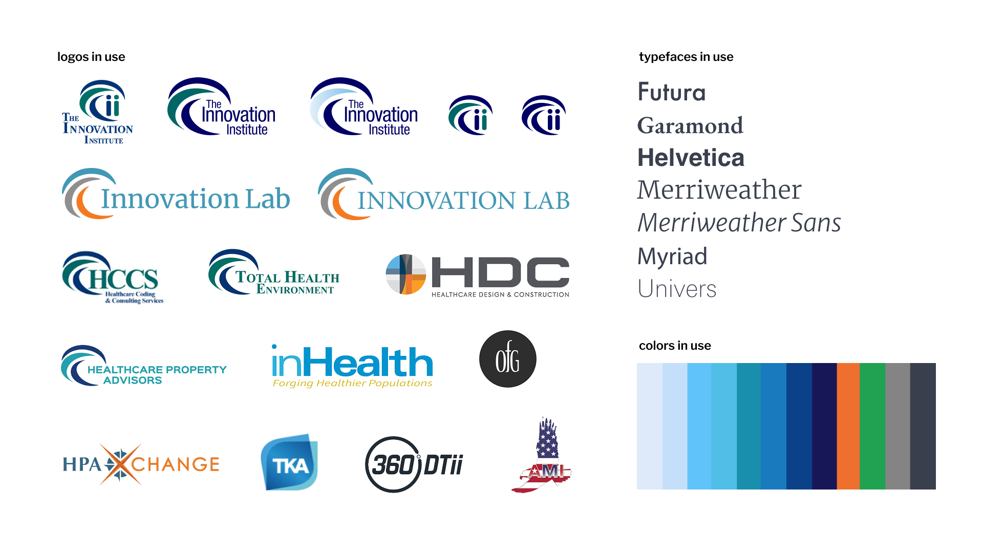
The client: Inneo is a Southern California-based company with major business units in healthtech innovation, hospital services, and medical real estate. Founded in 2013 as The Innovation Institute, the company was in the process of a strategic repositioning of business priorities that required a brand to perform a significantly different role. Gigantasy worked directly with company leadership to build a new identity system that communicated their value prop more effectively to an increasingly diverse set of audiences.
The challenge
Moving from a largely below-the-line holding company with a significant R&D element to a multifaceted healthcare services provider, the existing name and brand were out of step with what they actually did. Competitive research uncovered green space around the core package of value props. So we set our strategic sights on starting a conversation centered around improved outcomes, efficient operations, and increased revenues.
The strategy
To ensure the brand was on firm footing for future growth while also supporting near-term business goals, the positioning process involved a combination of industry research, company anthropology, and deep-dive honesty sessions about realities and goals.
The result: a brand positioning that formed the basis not only for the final identity, but also a comprehensive update to their Mission/Vision/Value statements.
The work
Working together to move healthcare forward. That's the story at the core of Inneo's founding and at the core of their business model. The new company name and identity amplify that spirit of partnership and growth.
Name: from a longlist of hundreds of options to three finalists, Inneo was ultimately selected for its uniqueness, brevity, and its relationship to the previous Innovation Institute name.
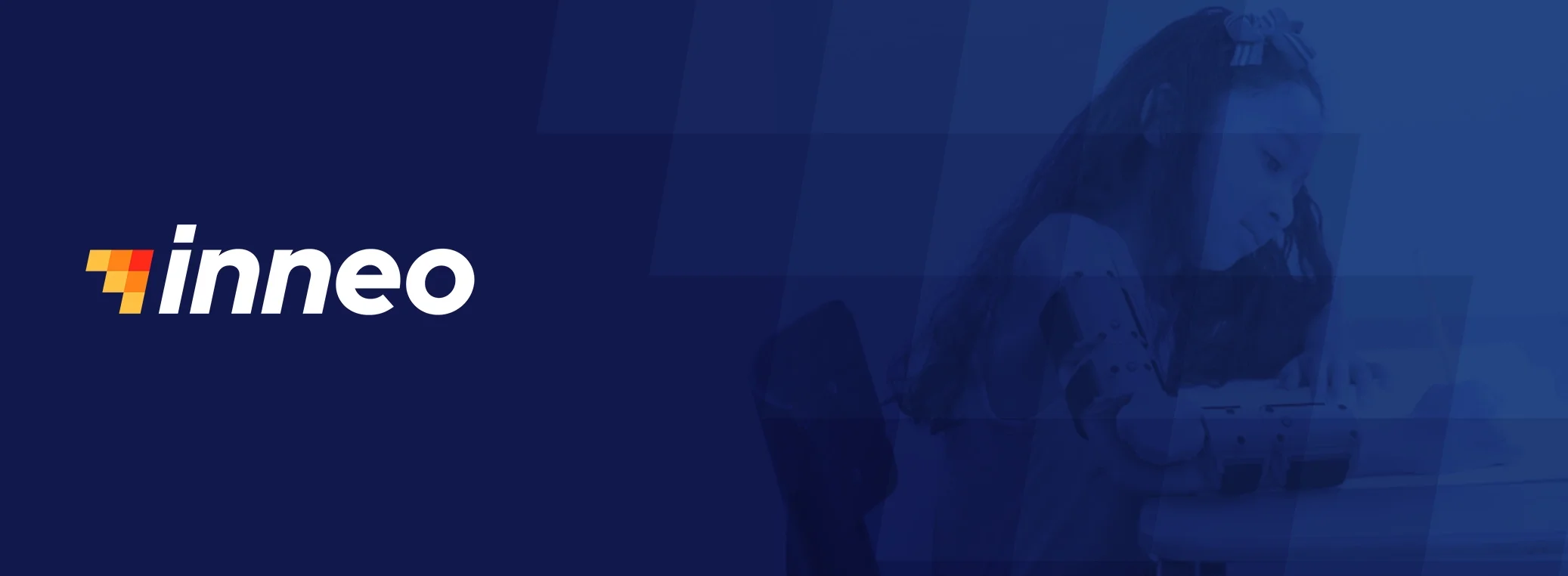
Logo: A nod to the moment of inspiration. The spark-inspired icon and strong, directional wordmark amplifies the brand's fundamental mission to move healthcare forward through discovery and innovation. The logo system provides a framework for growth as the company's business model evolves and expands.
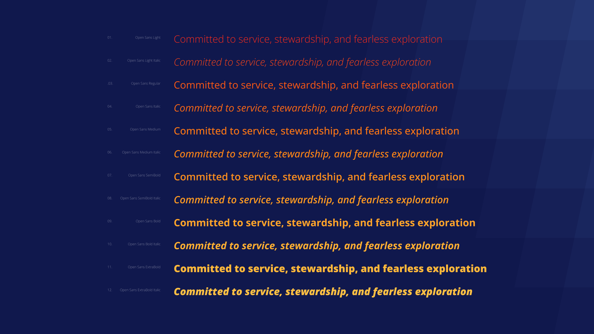
Typography: Open Sans reflects a confident and compassionate brand voice. Its versatile set of italics and condensed faces allows for visual variety across a broad set of applications.
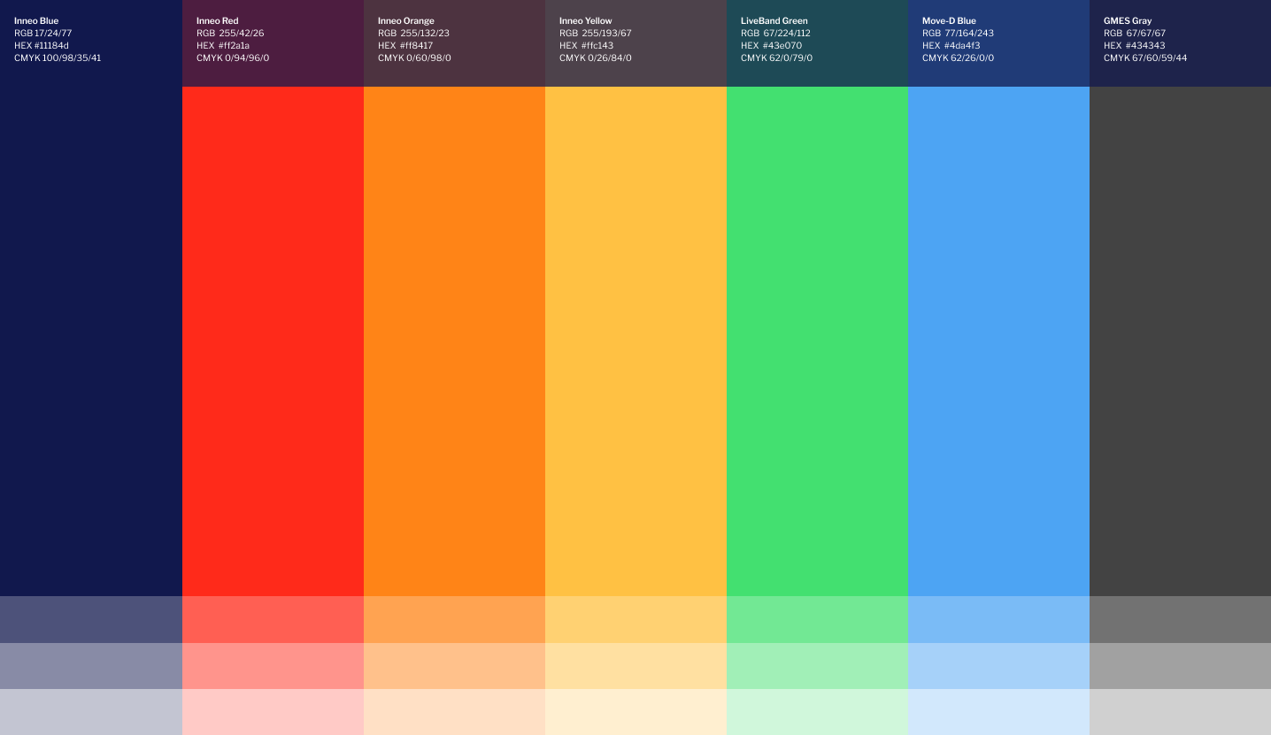
Color palette: The warm colors of the icon create contrast and energy when paired with the darker blues of the logotype. Accent colors, inspired by the products Inneo has co-developed, round out the palette to create a versatile system.
Design elements: Forward-leaning gradients call back to the logo and create a visual throughline at every level of the brand.

Icons: 100+ custom-built icons bring visual consistency across all areas of the business.
The Inneo name and identity makes the brand's story much easier to tell. This is reflected in a new website that more clearly defines the company's 'why' and demonstrates their impact across a wide range of challenges facing health systems. The gradient design motif adds an immediately identifiable element that is applied consistently across all media channels. Motion accentuates the forward progress at the heart of the brand's story. Every element of the brand – from tone of voice to color and typography – works together to communicate a singular story that healthcare leadership is more than ready to hear.
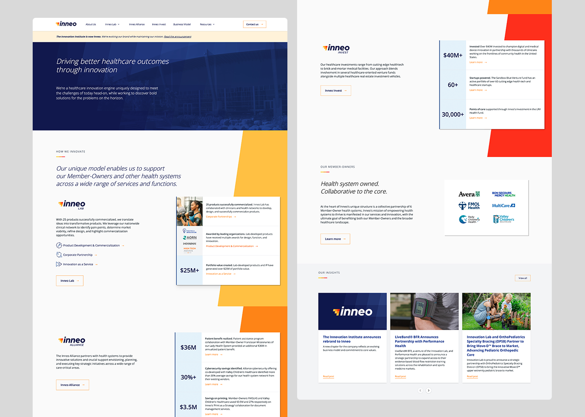
inneo.health website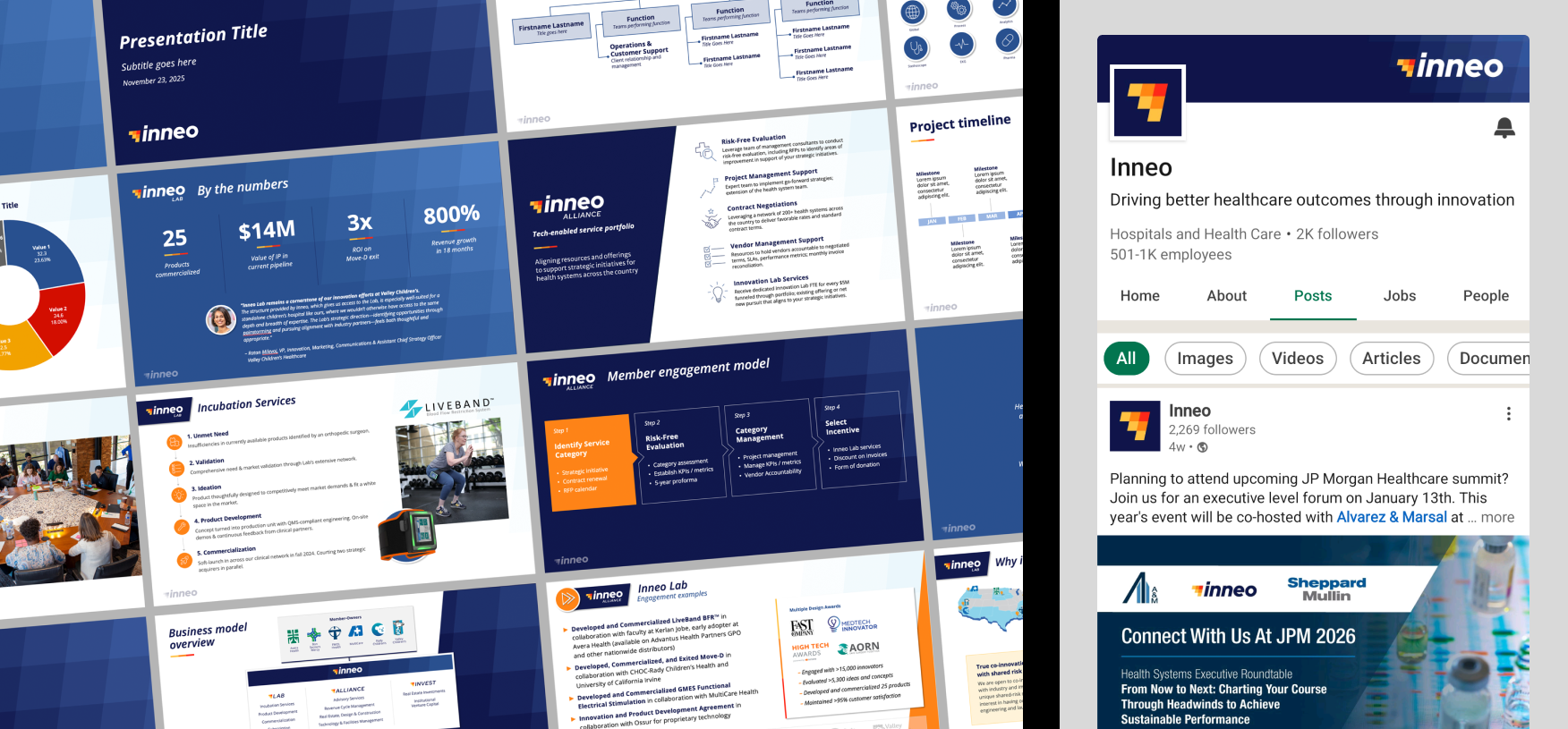
pitch deck + presentation template, social channel refresh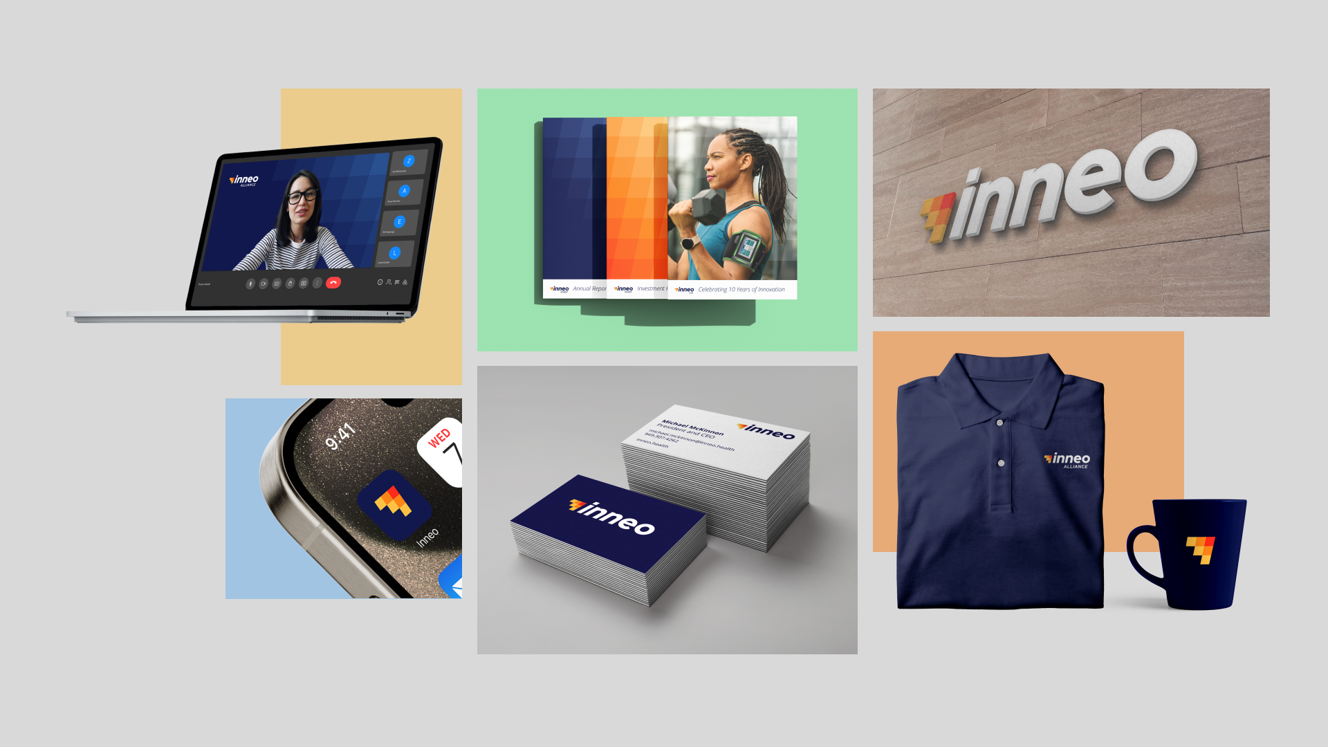

Related projects


Ready to take the first step?
Fill out the form and we’ll get back to you ASAP.